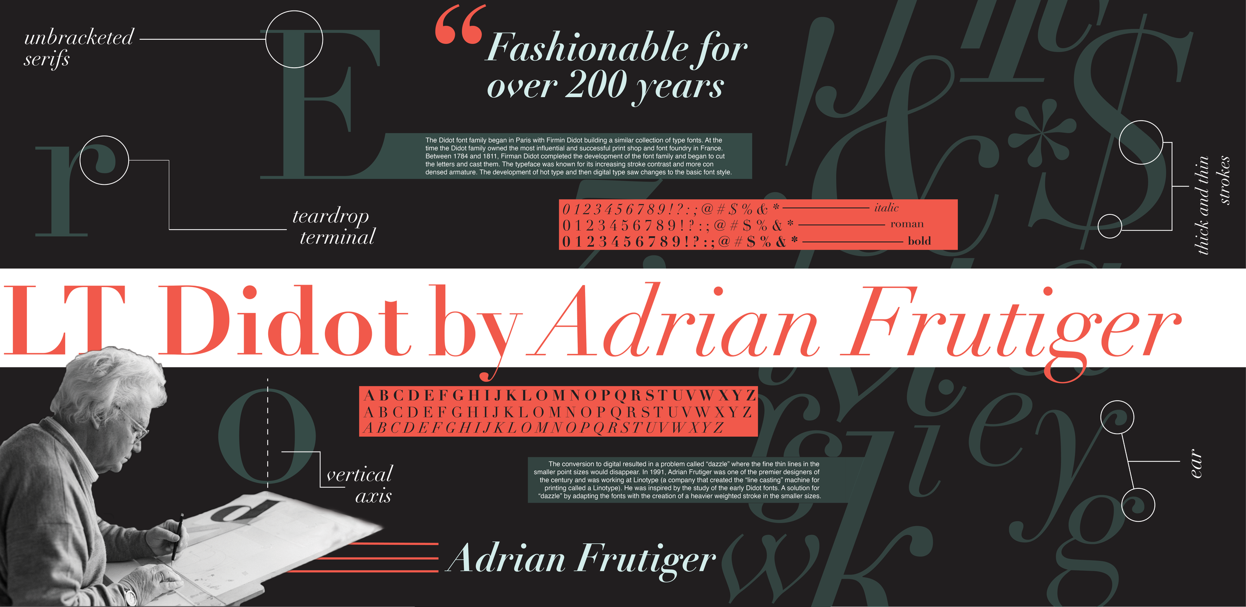
I was assigned to design a typographic poster. My subject is the font face LT Didot by Adrian Frutiger. This project showcases my ability to establish a visual hierarchy on a large poster format. The goal of this project is to create an interesting piece while honoring LT Didot and Adrian Frutiger.
Programs Used
Adobe Illustrator, Photoshop and InDesign
Inspiration


The Beginning
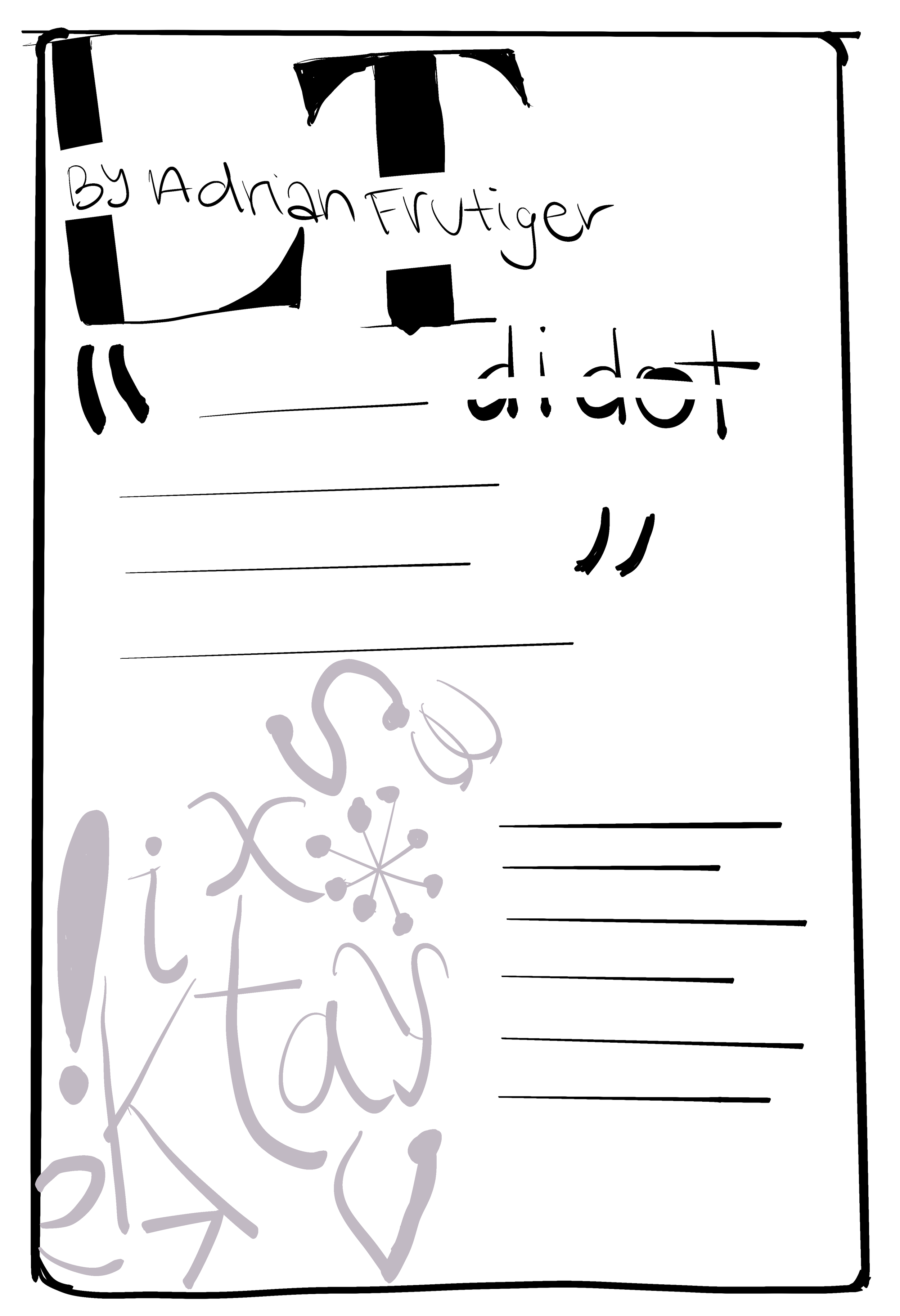
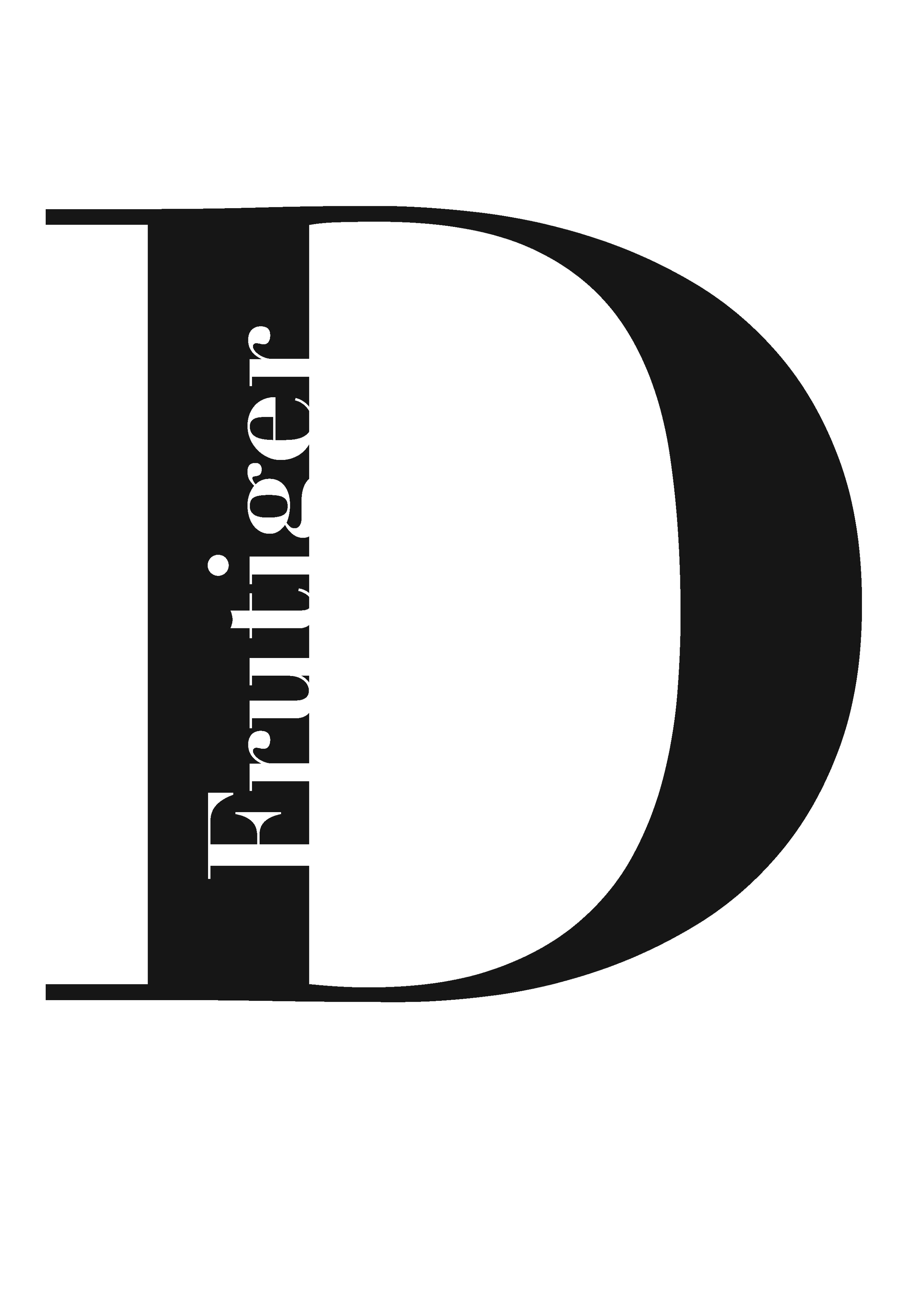
This project began with separate studies of type as image, typographer + font text/image, font/alphabet showcase, designed quote, and comparison of letter/classification. Below are my computer studies and hand sketches from each of the categories.







Creating the Posters
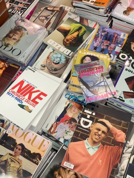
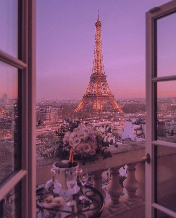
I was testing out some ideas for how I wanted to style my posters. I began by incorporating my studies where I could. I wanted to go for a classic, elegant, fashion magazine feel. I chose pink tones because it was simple and reminded me of Vogue Magazine. I was also experimenting with baby blue. I wanted these ideas to work but I was just not satisfied.


Getting Closer
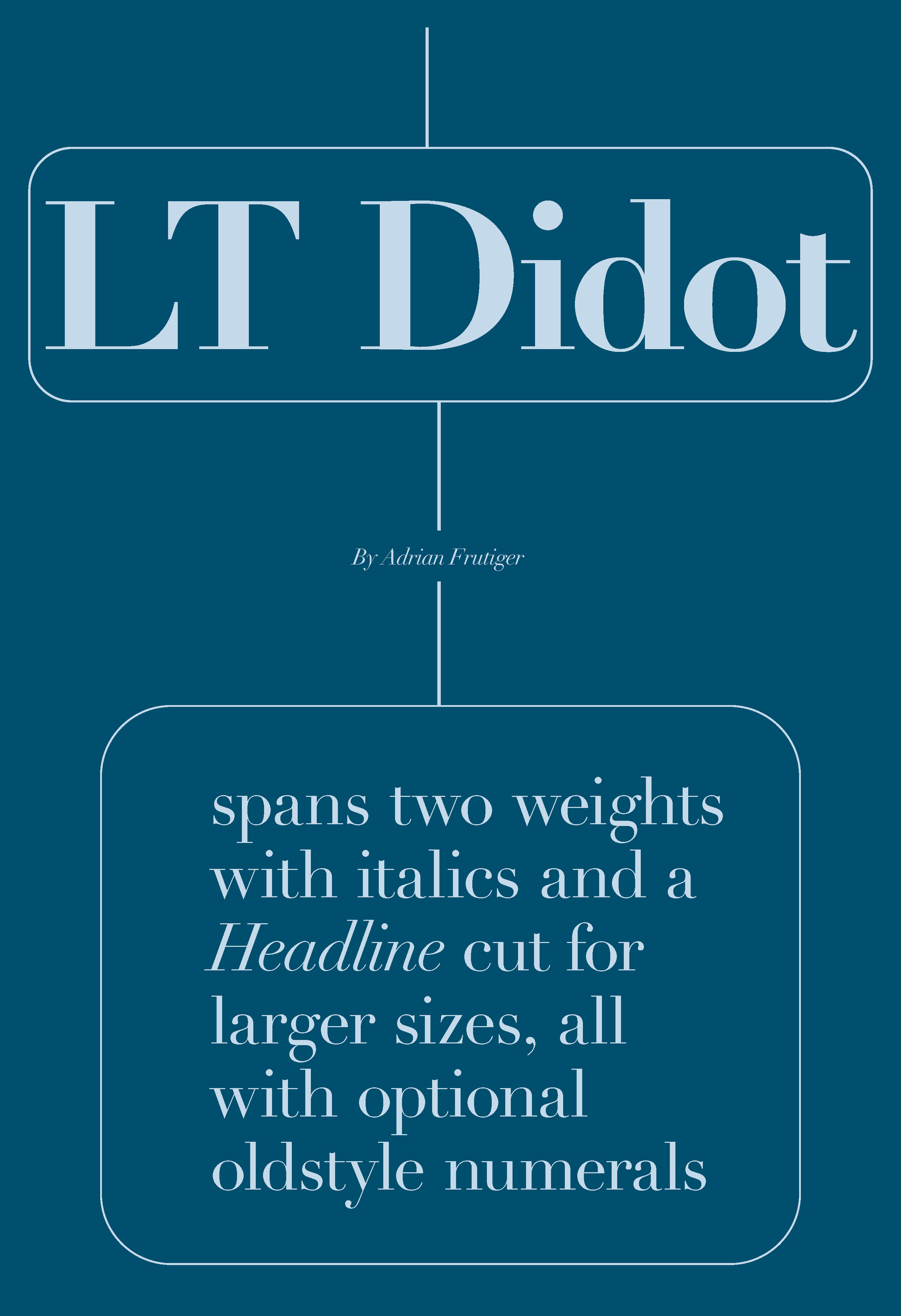
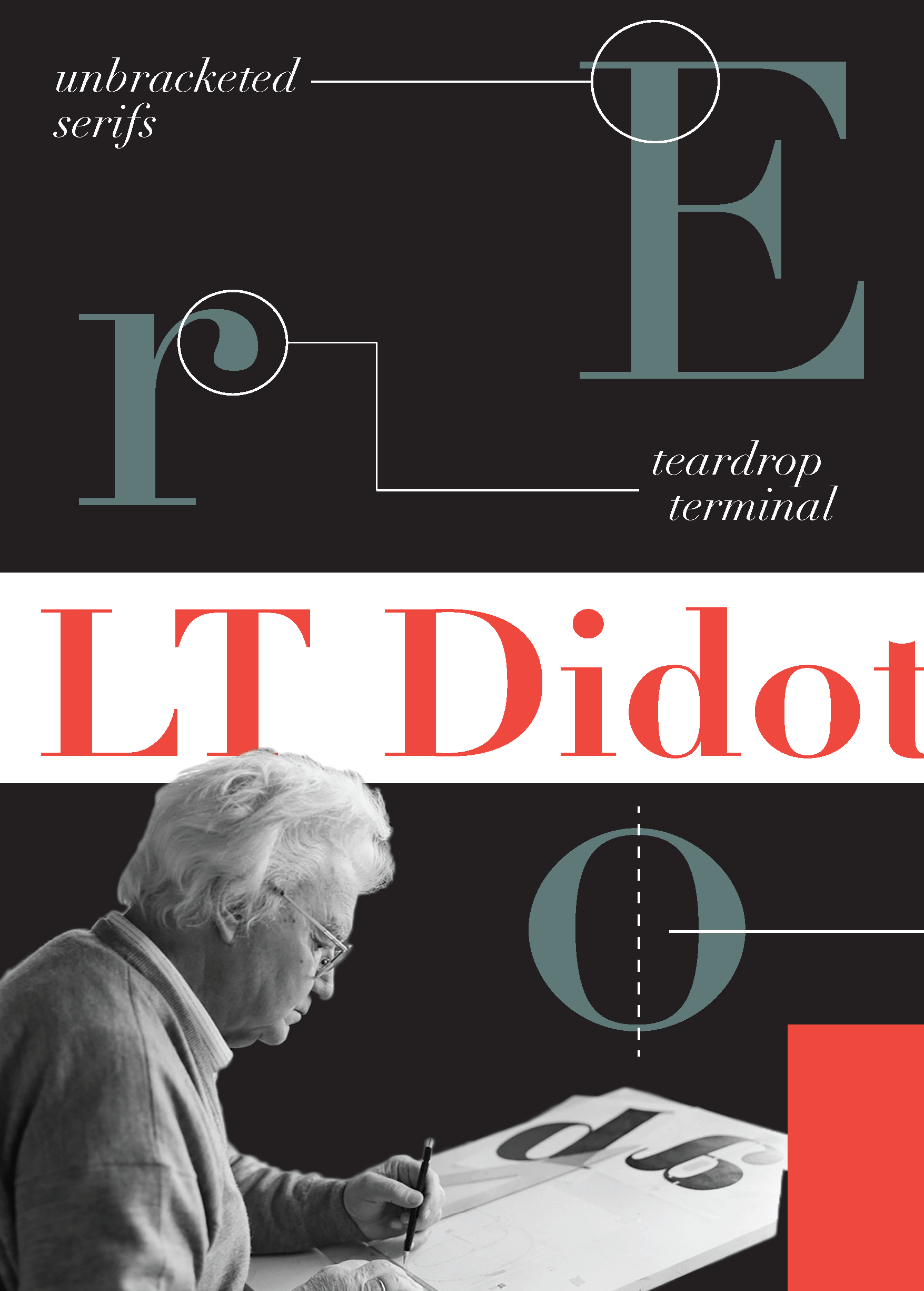
I decided the scratch the entire pink magazine idea. It wasn't me or my style. I instead embraced the modern feel of Didot. I chose to do a black background and bold but simple burnt orange and turquoise. I wanted to incorporate my studies more and experiment with graphic elements.

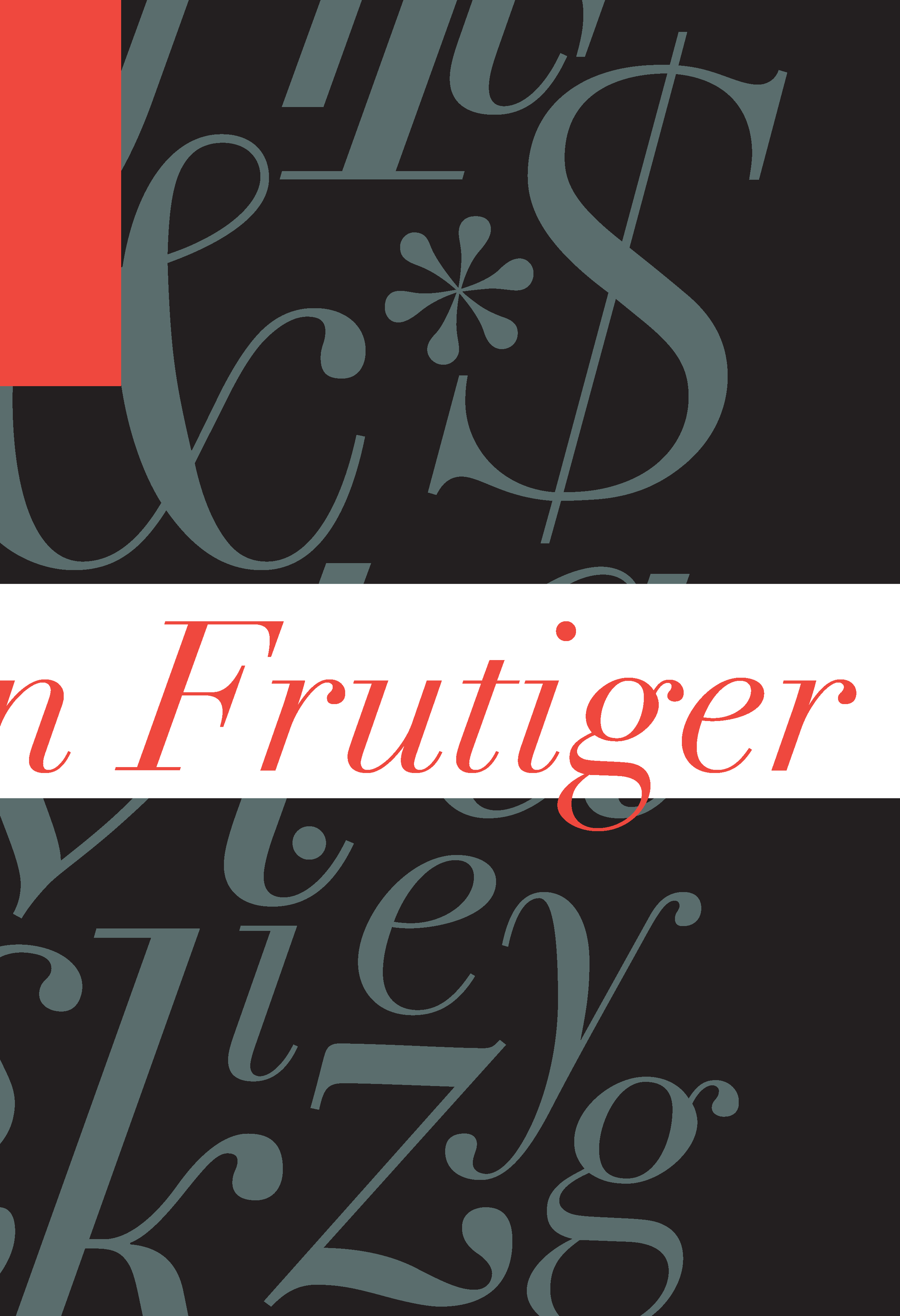
Final Result + Mockup
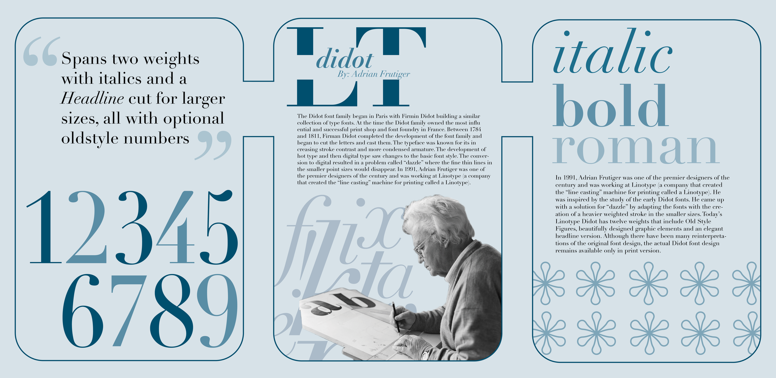
After some much-needed feedback, I began to explore more of my studies and continue with the horizontal flow in the posters. I wanted to ensure each poster could be by itself and still deliver the message I intended. My goal was to highlight the unique aspects of Didot while still honoring Adrian Frutiger and Didot's long history.


